







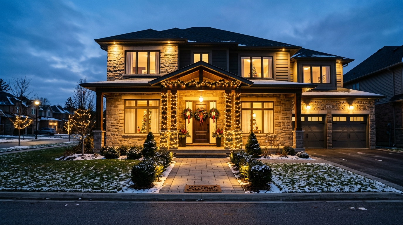
You have the wreath on the door, the inflatable snowman on the lawn, and a string of lights half-working along the roofline. Somehow, it still doesn’t look like the polished holiday scenes you see in your neighborhood. The problem is rarely the decorations themselves—it’s that they were chosen and placed separately, without a shared plan. Getting a cohesive look comes down to a few decisions: pick a consistent color temperature, repeat elements at different scales, and use newer options like popular outdoor holiday projection lights as a base layer instead of treating them as an afterthought. Here’s how to pull all of it together without overbuying or overcomplicating.
Quick Answer
To create a cohesive outdoor holiday look, limit your palette to two or three colors, match the color temperature of all white lights (warm white or cool white, not both), and repeat a few design elements at different scales. Use projection lights as your broad base layer, then add string lights, wreaths, and yard décor as accents. Keep one dominant focal point per viewing area so the eye knows where to rest.
Key Takeaways
- Choose warm white or cool white and stick with it—mixing them is the most common reason displays look messy.
- Limit your color palette to two or three colors and repeat them across every element, from tree lights to wreaths.
- Projection lights work best as a base layer that covers large surfaces, while string lights and ornaments act as accents.
- Give each viewing area one clear focal point; too many competing features flatten the whole display.
- Plan the layout on paper before buying anything, so every piece has a defined role.
Start With a Color and Temperature Plan
Cohesion begins before you hang a single light. Decide on two things first: your color palette and your white light temperature. Almost every mismatched display traces back to skipping one of these.
Pick Two or Three Colors Maximum
A classic red-and-warm-white scheme reads as traditional and calm. A blue-and-cool-white scheme feels modern and crisp. Adding a third accent—gold, silver, or green—works if it appears in at least three places. What breaks cohesion is adding a fourth or fifth color because a decoration looked nice in the store. Each new color competes with the others, and the eye can’t find a pattern.
Match Warm White to Warm White
Warm white (around 2700K) looks yellowish and cozy. Cool white (around 5000K or higher) looks bluish and sharp. Both are fine on their own. Mixed together on the same house, they make even expensive decorations look accidental. Check the packaging or product listing for the color temperature before buying, and if you already own a mix, group each type on separate sections of the house rather than interleaving them.
Use Projection Lights as Your Base Layer
Think of your display in layers, the same way you’d think about painting a room. The base layer covers the largest area with the least effort, and projection lights are built for exactly that job.
Projectors can wash a garage door, a bare wall, or a front lawn with falling snow, drifting stars, or moving patterns in seconds. That broad coverage means you don’t need to outline every surface with string lights, which is where most displays get cluttered. A few practical points:
- Projection distance matters. Most units list a recommended throw distance and coverage size. A projector placed too close creates a small, intense patch; too far, and the image gets dim and fuzzy.
- Surface texture affects clarity. A flat garage door or fence shows patterns cleanly. Bushes and rough stucco break up the image, which can look intentional (soft snowfall) or messy (blurry shapes), depending on the effect.
- Weatherproofing is not optional. Look for an IP65 or similar outdoor rating, and keep the plug connection off the ground or in a covered outlet.
- Motion can overwhelm. One moving projection reads as festive. Three competing motion effects in the same view read as chaos.
If you live somewhere with mild winters, projector-based displays are especially practical because there’s no ice to work around and you can reposition units mid-season without redoing wiring.
Build Accents That Repeat Your Theme
Once the base layer covers your large surfaces, accents tie everything together. The key is repetition—using the same motif or color in different sizes and materials.
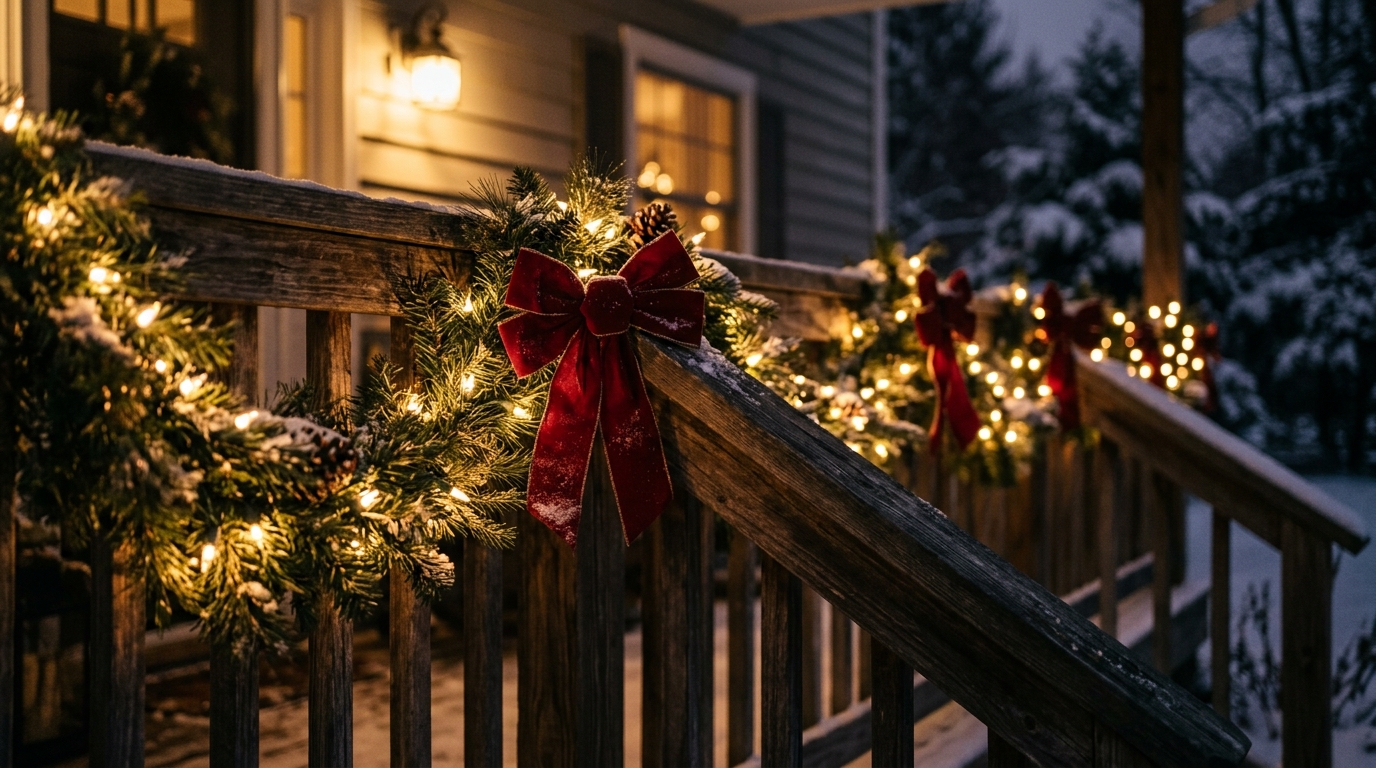
If your projection shows snowflakes, carry snowflakes into wreaths, window decals, or yard stakes. If your palette is red and warm white, make sure the wreath ribbon, the pathway stakes, and the tree lights all honor it. Repetition is what makes a display look designed rather than collected.
Scale Creates Visual Rhythm
A single large inflatable, a medium wreath, and small pathway lights create a natural hierarchy. Three large inflatables of similar size compete with each other and flatten the composition. As a rule, one large feature per viewing angle, supported by medium and small elements, keeps the eye moving comfortably.
Don’t Forget Daylight
Your display is visible during the day too. Unlit inflatables, tangled extension cords, and bare projector stands still affect how the yard looks. Choose décor that holds up visually when the lights are off, and route cords along edges rather than across the middle of the lawn.
Match Décor Style to Your Home’s Architecture
Cohesion isn’t only about the decorations matching each other—it’s about them matching the house. A Craftsman bungalow with natural wood trim carries warm white and greenery far better than an explosion of inflatables. A modern home with clean lines handles cool white, geometric shapes, and minimal color better than a Victorian-style scheme.
This doesn’t mean you can’t do a fun, maximalist display. It means the style should be a deliberate choice rather than an accident. If your home is traditional, lean into red, green, and warm white. If it’s modern, cool white with a single accent color usually looks sharper than a mixed palette.
Plan Placement Before You Buy
Most display mistakes are layout mistakes, and most layout mistakes happen because people buy first and plan later. A short sketch solves this.
- Stand at the street and note your main viewing angle.
- Mark your focal point—usually the front door, a large window, or a prominent tree.
- Assign your base layer (projection or broad light coverage) to the largest surface.
- Place one large accent near the focal point.
- Fill remaining space with small repeated elements like pathway lights or stakes.
- Check that every element fits your palette and color temperature.
This process also prevents overbuying. When each piece has a defined role, you stop adding decorations just because they’re available.
Common Mistakes That Break the Look
Even with good intentions, a few specific errors show up again and again:
- Mixing white temperatures. Warm and cool whites on the same house rarely look intentional.
- Too many focal points. Three competing large features in one view cancel each other out.
- Ignoring off-season storage. Décor that’s faded, cracked, or missing pieces looks worn no matter how well it’s placed.
- Overloading extension cords. Beyond being a safety issue, daisy-chained cords look messy and are harder to hide.
- Skipping daytime checks. Looking at the display only after dark hides problems you’ll see all day.
Frequently Asked Questions
Can I mix projection lights with traditional string lights?
Yes, and it’s often the best approach. Use the projector to cover a broad surface like a garage door or lawn, then add string lights on railings, trees, or rooflines as accents. Just keep both on the same color temperature if they emit white light.
How many colors should an outdoor holiday display use?
Two or three colors work best for cohesion. A two-color scheme is the safest and usually the most elegant. A third accent color is fine if it appears in multiple places rather than just one decoration.
Are projection lights bright enough to be seen from the street?
Most quality outdoor projectors are bright enough for a typical front yard, but performance depends on throw distance, surface reflectivity, and ambient light from streetlamps. Darker surfaces and shorter distances produce the sharpest image.
What’s the best way to hide extension cords and wiring?
Run cords along the base of walls, behind shrubs, or under mulch, and secure them with outdoor-rated clips. Choose cord colors that match the surface—green cords disappear against grass, and dark cords blend against fences or brick.
Should the front yard and backyard match?
They should share the same palette and color temperature, but they don’t need to be identical. Repeating one or two elements—like the same white light temperature and one accent color—creates continuity without requiring duplicate décor.
How early should I plan an outdoor holiday display?
Plan at least a few weeks before you intend to decorate. That gives you time to sketch the layout, check what you already own, buy missing pieces, and test lights and projectors before installation day.
Conclusion
A cohesive outdoor holiday display comes down to a small number of deliberate choices: one color temperature, two or three colors, a clear base layer, and repeated elements at different scales. Projection lights handle the broad coverage so your accents can do their job without competing. Sketch the layout first, assign every piece a role, and check the display in daylight as well as at night. Do that, and the result looks designed rather than assembled—regardless of your budget.